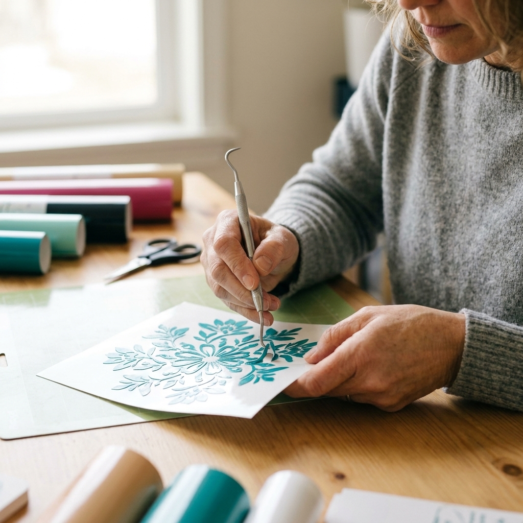
Cleanly weed delicate cuts with better lighting, smarter tool moves, and the right settings. Practical, beginner-friendly tips for Cricut vinyl and HTV proje...
Maker Vinyl
Updated October 17, 2026
15 Free Script Fonts for Cricut Vinyl Decals
These 15 free script fonts from Google Fonts cut cleanly on Cricut for vinyl decals, labels, and signs. Includes sizing, welding, offset, and weeding tips.

Harper Davis
Harper Davis is a lifelong DIY enthusiast and cutting-machine expert who loves helping beginners conquer Cricut Design Space. With over six years of experience running a custom vinyl shop, she shares practical tutorials, material guides, and creative inspiration.
If you have ever weeded a script decal and watched the little “tails” snap right off, welcome. I have been there, surrounded by expensive vinyl scraps, whispering “never again” to a beautiful but painfully fussy font.
The good news: there are truly free-to-use script fonts (especially on Google Fonts) that generally cut cleanly on a Cricut, even for smaller decals. The trick is choosing scripts with slightly thicker strokes, clean connections, and fewer wispy hairlines. And yes, your results will still vary based on your machine, blade sharpness, vinyl brand, mat grip, and how small you are trying to go, so a tiny test cut is your best friend.
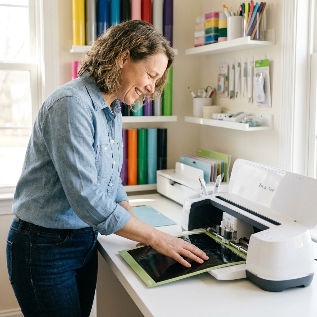
What makes a script vinyl friendly
When I am picking a cursive font for decals, I look for a few things that save you from weeding nightmares.
- Medium-to-thick strokes: Hairline strokes look pretty on screen but can tear or vanish in vinyl.
- Fewer separate pieces: Connected letters weed as one smooth shape instead of 40 tiny islands.
- Simple capitals: Overly loopy uppercase letters love to lift during weeding.
- Clean joins: Smooth connections mean fewer weak points that snap.
My quick rule: If the font looks like it was written with a fine-tip pen, I either size it up, add a small offset, or skip it for vinyl.
One more thing: Fancy swashes are usually the first to fail on tiny decals. If a word has long flourishes, try deleting the swash, choosing a simpler capital, or shortening the word before you cut.
Before you download
Many font sites label fonts as free, but the license can vary. Some are free for personal use only, while others are free for commercial use. Since lots of Maker Vinyl readers sell decals, here is my best practice:
- Download from reputable libraries (Google Fonts is my favorite for clear licensing).
- Open the license info and confirm whether commercial use is allowed for that specific font.
- If you sell finished items, keep a folder with font license files (or a saved license page) for your records.
Quick Google Fonts note: Most Google Fonts are licensed for commercial use under open licenses like the SIL Open Font License (OFL) or Apache 2.0. Still, always verify the license on the specific font page, and pay attention to any reserved font name or redistribution terms if you are bundling or sharing files.
15 free script fonts that cut well
Below are my favorite free script fonts for vinyl decals. I included what each one is best for, plus cut-friendly tips so you can get clean lines faster.
Quick sizing note: When I mention “letter height,” I mean the approximate height of the lowercase letters in your word, not the full design height including tall flourishes.
1) Great Vibes (Google Fonts)
Why it works: Elegant, smooth connections with strokes that stay readable when sized appropriately.
Best for: Wedding decals, glassware, welcome signs.
Cricut tip: For small names, start around 0.5 in letter height (lowercase letters) or larger. Weld if letters do not fully connect.
2) Allura (Google Fonts)
Why it works: Simple, clean script with minimal fussy loops.
Best for: Pantry labels, envelopes, minimalist decals.
Cricut tip: If you cut small, add a tiny offset to thicken the lines before cutting.
3) Pacifico (Google Fonts)
Why it works: Bold, rounded script that is very forgiving to weed.
Best for: Tumblers, kid decals, playful logos.
Cricut tip: Use the correct vinyl material setting, then adjust pressure (Less, Default, More) based on a test cut. If corners look rough, try Less pressure with a sharper blade.
4) Lobster (Google Fonts)
Why it works: Thick strokes and sturdy connections. This one forgives a lot.
Best for: Large decals, storefront signage, bold labels.
Cricut tip: If you set text in another program (Illustrator or Inkscape), check spacing after importing into Design Space. Reduce letter spacing so letters touch, then weld for a single cut shape.
5) Dancing Script (Google Fonts)
Why it works: Friendly, bouncy script that stays legible.
Best for: Gifts, teacher labels, party decor.
Cricut tip: Keep it above about 0.35 in letter height (lowercase) for adhesive vinyl so thin joins do not tear.
6) Satisfy (Google Fonts)
Why it works: Slightly brushy look without extreme hairlines.
Best for: Water bottles, notebooks, simple decals.
Cricut tip: Test-cut your smallest size on scrap vinyl first. If it weeds poorly, bump size up 10 to 15 percent.
7) Yellowtail (Google Fonts)
Why it works: Confident strokes, retro vibe, and clean weeding.
Best for: Car decals, shop decals, statement words.
Cricut tip: If curves look a little jagged, try a different material setting that other crafters recommend for your vinyl brand, then fine-tune pressure with a test cut. A fresh blade helps a lot on curvy scripts.
8) Alex Brush (Google Fonts)
Why it works: Pretty swashes with enough thickness to survive vinyl cutting.
Best for: Names on cups, memorial decals, fancy labels.
Cricut tip: Watch the uppercase letters. If a capital has a skinny loop, add a small offset or use a simpler lowercase start.
9) Courgette (Google Fonts)
Why it works: Casual cursive that is surprisingly sturdy, even in smaller sizes.
Best for: Kitchen labels, planner decals, jar lids.
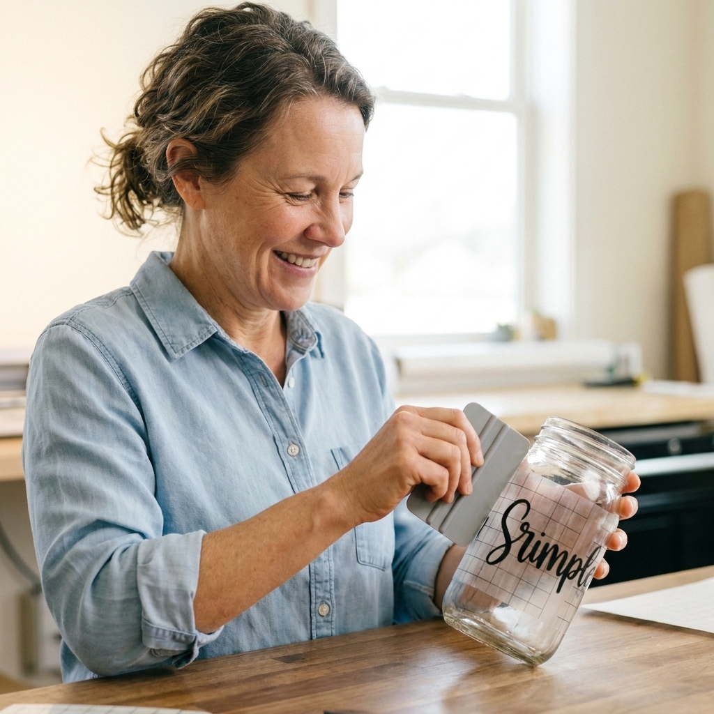
Cricut tip: On glossy permanent vinyl, burnish your transfer tape well so the small curves lift cleanly.
10) Kaushan Script (Google Fonts)
Why it works: Thick brush-style strokes and connected letters.
Best for: Bold quotes, signage, canvas tote decals.
Cricut tip: Great for layering because it holds its shape. Use about a 0.07 in offset for a clean shadow layer.
11) Sacramento (Google Fonts)
Why it works: Clean, modern script with fewer dramatic loops.
Best for: Minimalist decals, product labels, sleek drinkware.
Cricut tip: If letters look disconnected, reduce letter spacing until they touch, then weld to prevent tiny gaps that snag while weeding.
12) Cookie (Google Fonts)
Why it works: Soft and rounded with thicker strokes, very beginner-friendly.
Best for: Bake-sale packaging, kid crafts, cheerful labels.
Cricut tip: This one is a solid choice on removable vinyl for wall quotes because it stays readable without ultra-thin pieces.
13) Tangerine (Google Fonts)
Why it works: Elegant calligraphy look, but not too fragile when sized appropriately.
Best for: Invitations, acrylic signage, formal decals.
Cricut tip: Use the bold style when possible for vinyl. It is much less fussy to weed.
14) Merienda (Google Fonts)
Why it works: Playful script with consistent stroke width.
Best for: Coffee bar signs, labels, fun slogans.
Cricut tip: If you cut it small, use a fresh mat so curves do not shift while cutting.
15) Sofia (Google Fonts)
Why it works: Rounded, friendly script with thicker lines that hold up well in adhesive vinyl.
Best for: Everyday labels, organization bins, beginner projects.
Cricut tip: For tiny labels, switch to a new fine-point blade (or a sharp premium blade) to keep corners from tearing.
Availability note: Font libraries can change over time. If you cannot find one of these on Google Fonts, check spelling first, then try searching the exact name on fonts.google.com.
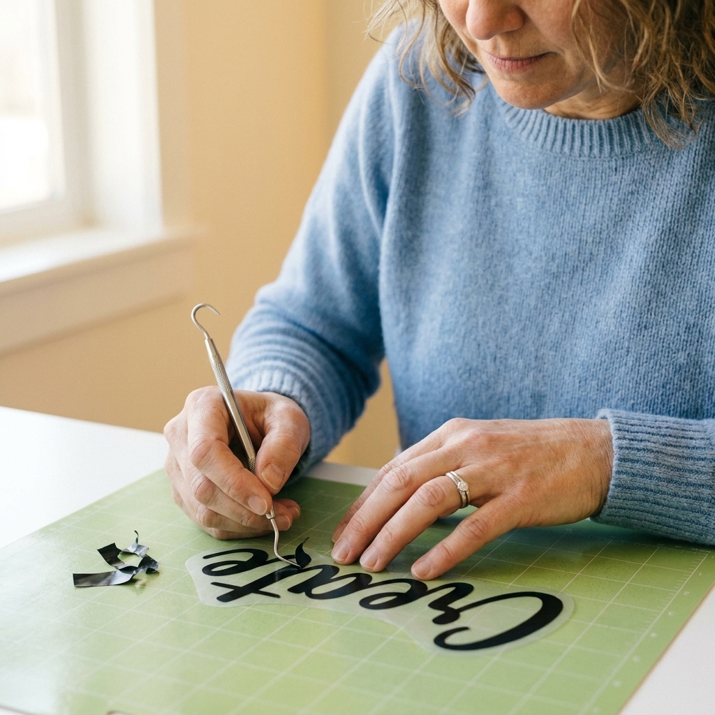
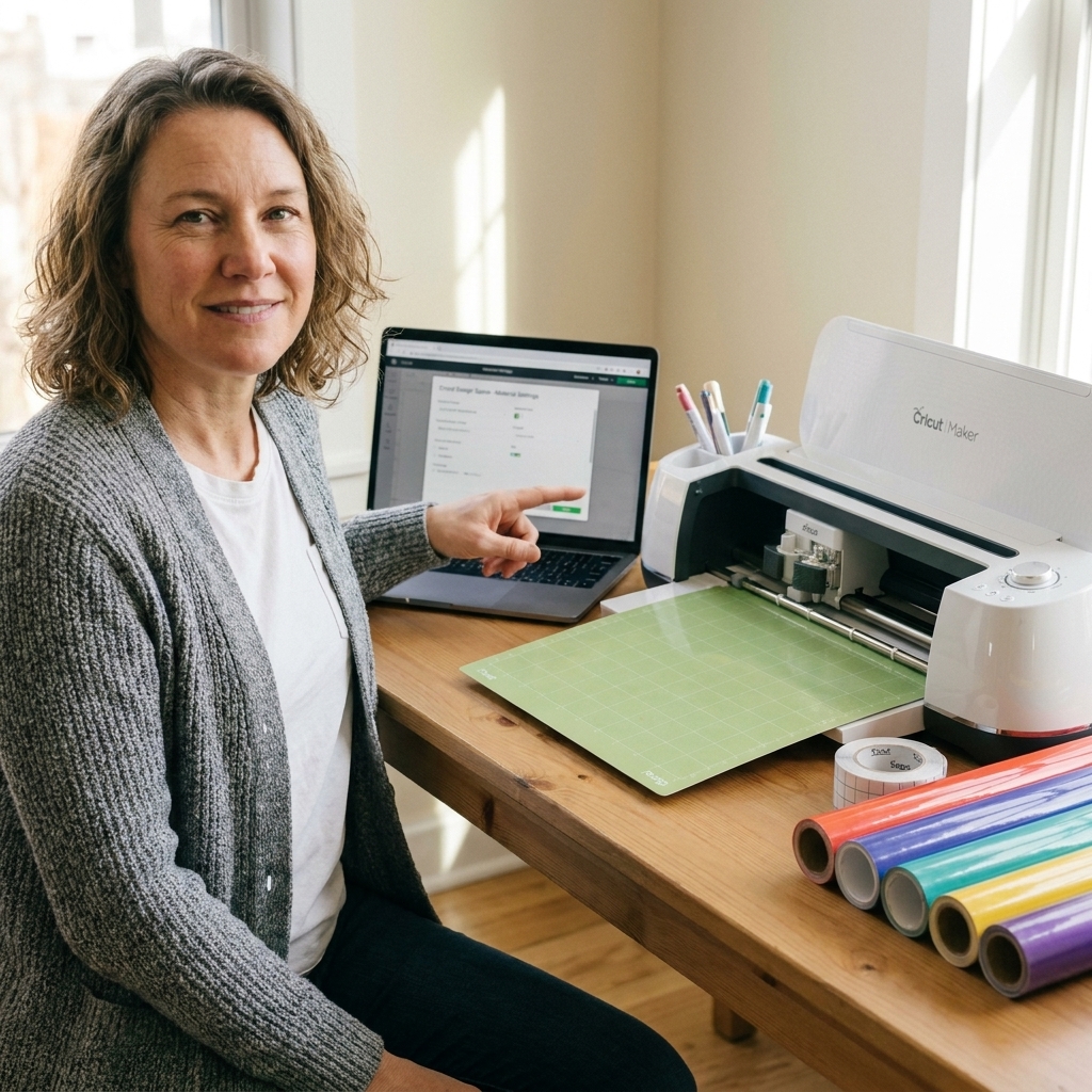
Design Space settings for script decals
If your font is solid but the cut is still messy, it is usually a settings or prep issue. Here is my repeatable checklist.
1) Weld connected script words
Select your text, then click Weld. This prevents Cricut from cutting each letter as a separate shape. It also helps your script stay together when you apply transfer tape.
If your Design Space layout looks different, use the option that turns overlapping letters into one single cut piece. The goal is the same, even if the button name or location changes in future updates.
2) Use Offset to thicken delicate scripts
If a script is pretty but slightly too delicate, add an Offset (start small, like 0.04 to 0.08 in). Then either:
- Cut only the offset layer for a chunkier, easier-to-weed version, or
- Weld the text and offset together if you want one solid piece.
3) Dial in the cut with test cuts and pressure
Start with the correct vinyl material setting for your vinyl type, then run a small test cut. If you see dragging, lifted corners, or tiny tears, try Less pressure first. If it does not weed cleanly, try More pressure.
If you cannot get a clean cut, try a different material setting that matches your vinyl more closely, then re-test. A sharper blade often fixes “mystery” rough edges faster than any setting change.
4) Match mat grip to your vinyl
- StandardGrip: Most permanent and removable vinyl sheets.
- LightGrip: Thin vinyl or anything that tends to curl.
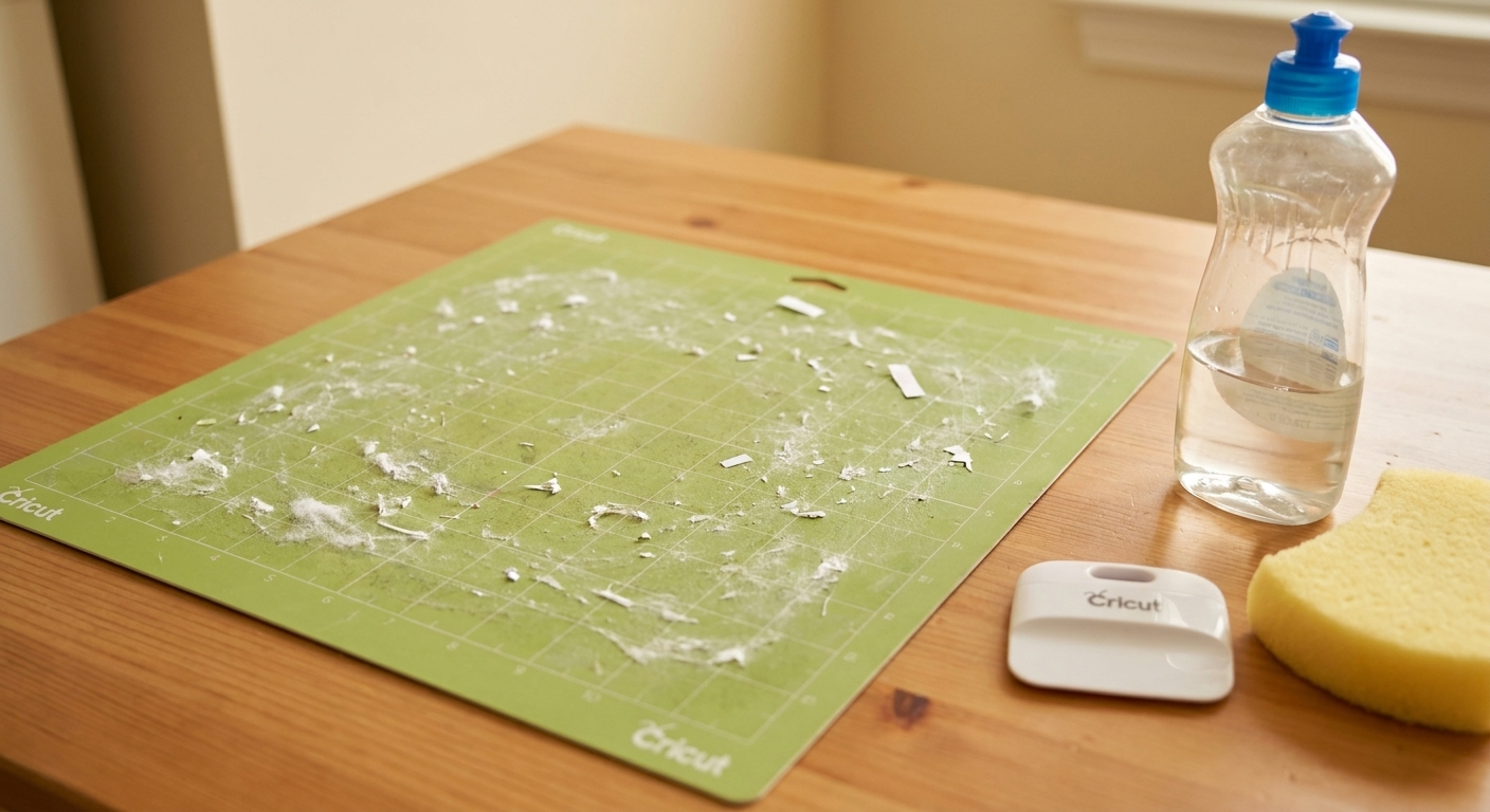
A too-sticky mat can warp vinyl when you peel it up, and warped vinyl is a recipe for lifted loops.
5) Weed warm, not hot
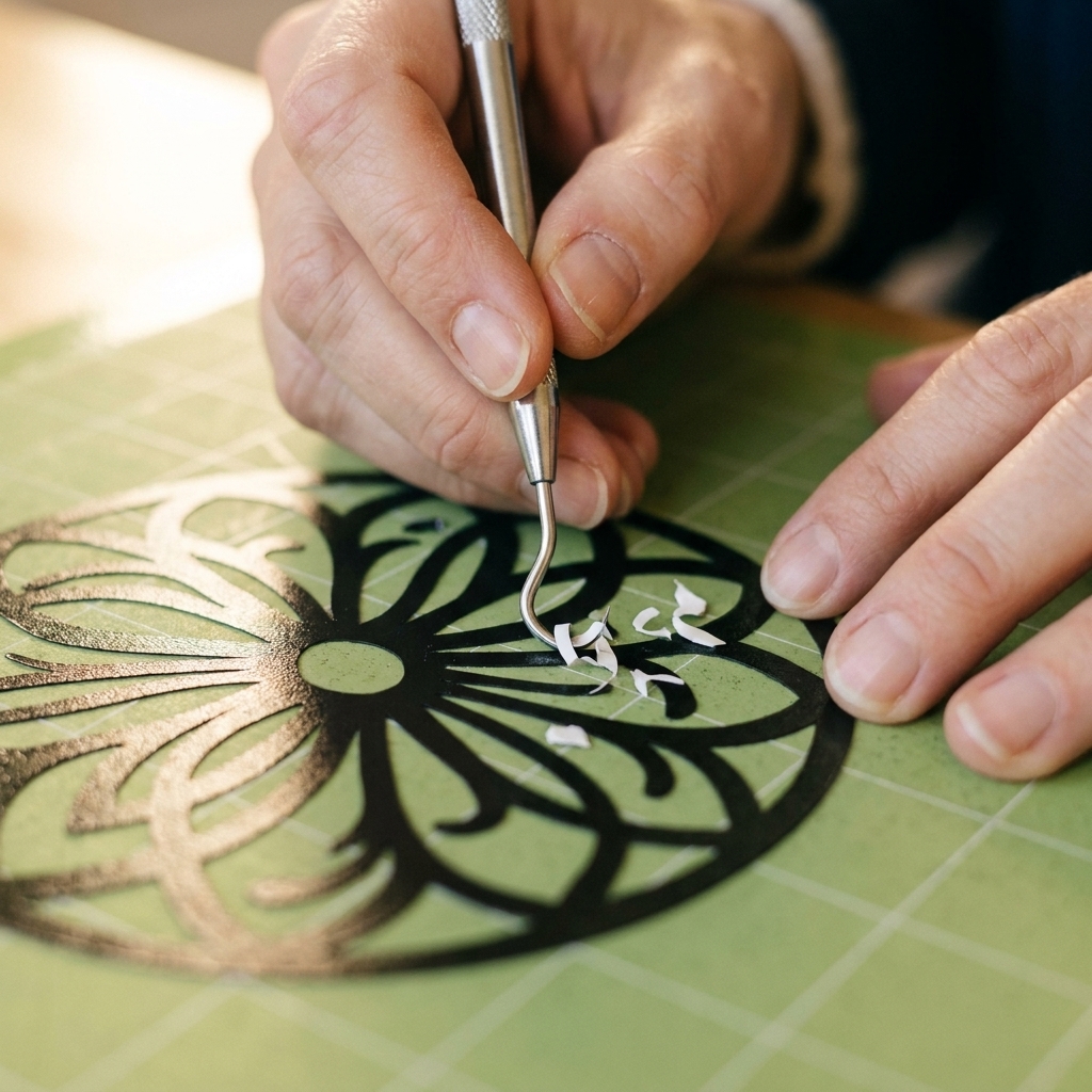
This tip is for adhesive vinyl weeding. If your craft room is chilly, warm the vinyl slightly with your hands. Warm vinyl is more flexible, which helps delicate script survive weeding. Skip the blast of heat. Too much heat can soften the adhesive and make weeding messy.
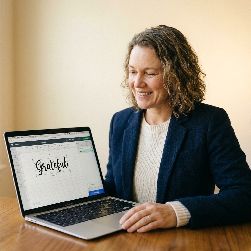
Minimum sizes to start with
These are practical starting points for standard adhesive vinyl and most script fonts. You can go smaller with bold scripts like Pacifico or Lobster, but this keeps things beginner-friendly.
Important: When I say “letter height,” I mean the approximate height of the lowercase letters in your word, not the full design height including tall flourishes.
- Adhesive vinyl decals: Start around 0.35 in to 0.5 in letter height for script.
- Tumbler names: Usually 2.5 in to 4 in wide overall, depending on the cup and the font thickness.
- Car decals: Often 4 in to 10 in wide so script stays readable from a distance.
- Very small labels: Consider a simple sans serif for tiny text, or use a bold script and keep words short.
Quick troubleshooting
My script is cutting into the backing
Reduce pressure or choose a lighter material setting. Also make sure you are using the right blade (usually a fine-point blade) and that it is seated correctly in the housing and clamp.
My vinyl is tearing while I weed
Most of the time this is either too small of a font size, a dull blade causing drag, or too much pressure over-slicing corners. Increase size, switch blades, and test a lighter pressure.
My letters are not touching in Design Space
Adjust letter spacing until the script connects, then weld. If you weld before the letters truly touch, you can get odd overlaps or tiny gaps.
My script will not transfer cleanly
Use the right transfer tape strength for your vinyl. Burnish well, then peel the vinyl backing away from the tape slowly, keeping it low and tight.
FAQ
Are Google Fonts free for Cricut projects?
Most are free to use under open licenses like SIL OFL or Apache 2.0, which typically allow personal and commercial use. Still, check the license on the specific font page if you are selling finished decals, and keep a copy for your records.
Do I need to unzip a font file before installing?
Yes. Download, unzip, then install the .ttf or .otf. After installing, fully close and reopen Cricut Design Space so it refreshes your system fonts.
Why does my script font look thicker after welding?
If letters overlap heavily, welding can create chunky joins. Reduce overlap by tweaking letter spacing first, or switch to a script with cleaner connections.
What is the easiest script font to weed?
For most beginners, start with Pacifico or Lobster. They are bold, forgiving, and still cute.
Are script fonts the same as writing fonts?
Not always. Most script fonts are outline fonts, meaning Cricut will cut the outer edges of the letters (perfect for vinyl decals). “Writing fonts” are designed to look like single-line pen strokes for Draw or Foil, which is a different look and workflow.
Do I need to mirror for vinyl?
For adhesive vinyl, do not mirror. For iron-on (HTV), mirror your design because you cut it in reverse on the carrier sheet.
Wrap-up
If you take one thing from this list, let it be this: do a small test cut before committing to your whole sheet of vinyl. Even the best fonts behave differently depending on brand, blade sharpness, mat stickiness, and how tiny you are trying to go.
If you want, tell me what you are making (tumbler name, car decal, pantry labels, wedding signage) and what vinyl brand you are using, and I will suggest the best font from this list and a starting size that should weed cleanly.